Drawing, Inking and Scanning
I began the project by drawing all of my pictures and words (except for titles) on paper in pencil and then inking over the lines with black ink and a small brush. For the pictures with very small detail and for the decorative dotting on the lettering, I used a black fineliner. The brush gave a more artistic and unique stroke on the lines of the drawings and the fineliner gave more precision which was necessary when inking fine detail.
This is one of my original scans. When I imported my scans into Photoshop, I changed colour settings of the image to make the background solid white and the inkings solid black. This made the scanned drawings look sharper and bolder. I made a spelling mistake on the word pencil (don't laugh) but I was able to fix this in Photoshop by re-ordering the letters of the word.
Using Photoshop
I first placed all of my hand-drawn scans.
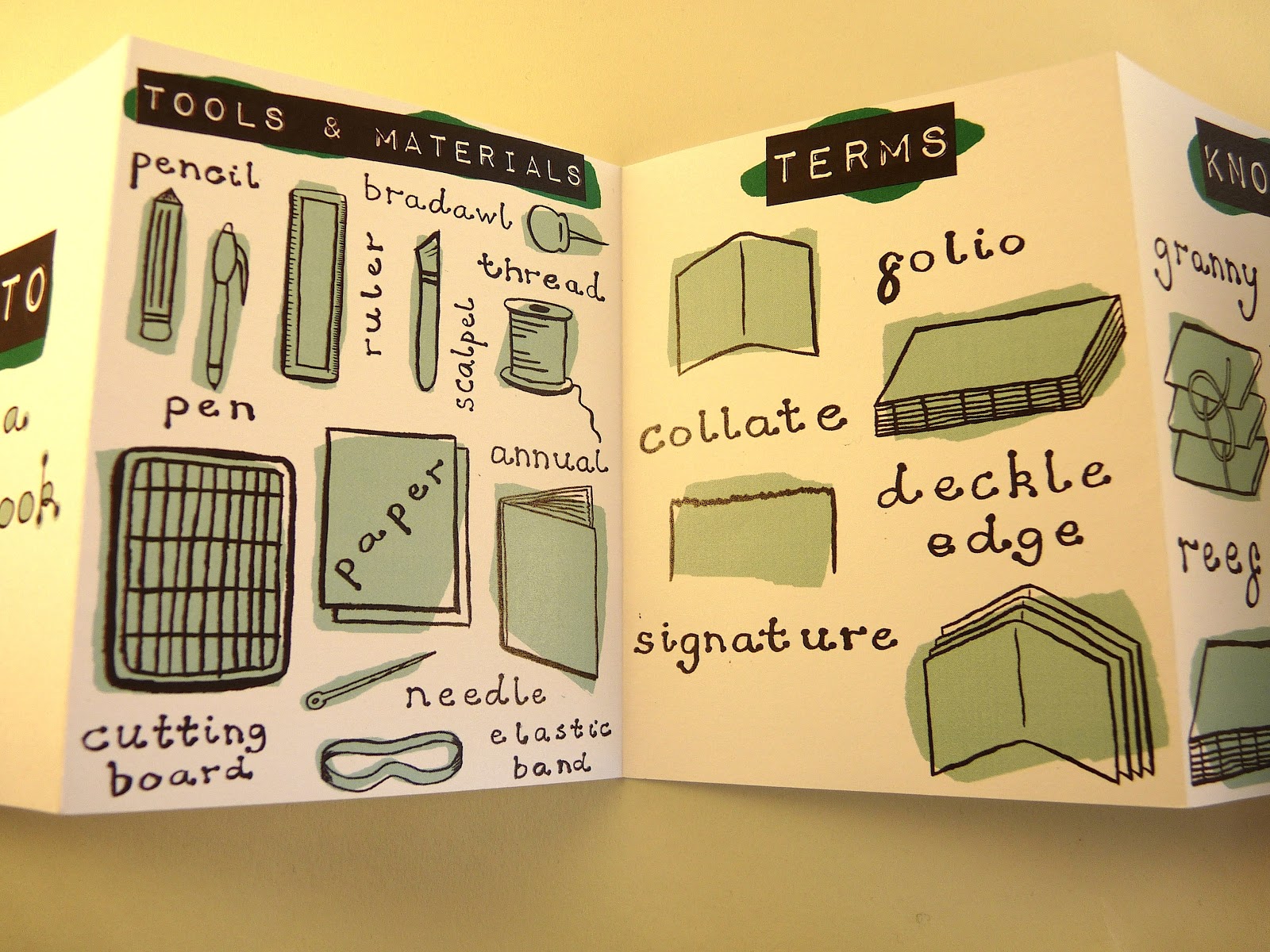
I then added titles using a font I downloaded called 'Impact Label'.
Next I added colour to the titles. I used a dark green and drew shapes similar to paint splats behind the titles.
Finally I added colour to the pictures. I used a lighter shade of green and used the same paint splat style.
This is my finished second page.
I then printed my sketchbook manual and cut, folded and stuck it together into an accordian book.
What I Learned
During this project, I learned a lot more about how to use the program Adobe Photoshop than I knew previously. Before the project, I had only minor experience with the program and so after completing this project, I now feel much more confident in using Photoshop for this use.


No comments:
Post a Comment