
The Brief For My Chosen Piece
My chosen piece is my Sketchbook Manual. The brief for this task was the create an accordion book manual of instructions on how to make a hand-made sketchbook like the one we made during this unit. We used hand-drawn images which we outlined with ink and then scanned in to use on our manuals. I approached this with the idea to do simple, cartoon-like drawings for each step and using some had-written text. I began by trying out different ideas in pencil, before choosing the best bits that I wanted to use on my manual. I inked over the designs I liked so that they would show up bold in the scan.
We used a template in Photoshop to create it with. I used a mixture of hand-written text and digital text on my manual. Once I had placed all of the drawings and text, I foudn that it looked quite bland and uninteresting. To fix this, I decided to add some colour but keeping it block and bold, similar to a splat of paint. I used just two block colours, pale green and dark green, in splat shapes behind text and drawings to highlight and make my manual look more interesting and colourful. I was very happy with the outcome of this piece after seeing it printed and folded into shape. I think keeping the colour scheme to the two shades of green was a good idea as it adds flavour while keeping it simple to understand and uncluttered.
A Piece That Has Been Influenced By Another Designer
 A piece of mine that came from the influence of another artist is my Small Press Comic. This task was influenced by John Porcellino and his King Cat Comics & Stories. His comics include quirky, distinct-style drawings in his stories that are laid out in the usual conventions of a comic, in square panes with little text and expressive drawings. I liked his style very much as I myself enjoy drawing in a simplistic, cartoon style.
When making my own comic, I first planned it out in pencil before going over it all in black fineliner making it look bold. Porcellino includes stories with a happy-sad theme and so I tried to mimic this in my own comic, using stories of my real life experiences. I also mimicked his style on the front cover, using the same format for the title, naming mine "Mr Owl Comics & Stories". I also mimicked his first page of "Top Twenty things".
I am very pleased with the final outcome of my small press comic as I have managed to create a mini comic using the style of John Porcellino while still being able to add my own style to it. On some pages I included more content that others, such as the How To Be A Tourist page which has lots of drawings and text on it, compared to the page containing just a poem central on the page surrounded by stars. I like this page quite a lot as I took a risk in making it very minimal with very little drawing to go with the poem, which I think works best.
I think that this task helped me in developing my own preferred style of drawing. I already enjoyed drawing in simple lines in a cartoon-like style, and this task gave me more experience in drawing like this and helped me come out with a piece that I am proud of.
A Piece Where I Have Experimented With Different Processes
 For my magazine, I used a range of processes to come out with my final front cover and double-page spread. I used hand-drawn techniques for my magazine title and iconography. I drew the title Freshers in a font I liked and then added the colour in Photoshop afterwards. By colouring digitally, I am able to try a number of different colour combinations before choosing. I also hand-drew my iconography. I chose to do each drawing because they were to do with Emma Watson's films and film in general. I coloured these in by hand.
 I used photography for my cover photos. I took photos of a subject, trying to mimic the placeholder photos I had of Emma Watson by using bright lighting and similar poses and facial expressions. When I placed them onto the magazine, I decided to add more to draw attention to the photos. On my front cover, I added a white diamond pattern on a pale purple background, originally planned to just be white. This gave a much more detailed and interesting look to the front cover. For the double-page spread photo, I changed it to greyscale like my Emma Watson placeholder photograph because it worked well with the bright green sidebar and the colourful iconography. I also added a white shine around the subject in my photo to draw attention to her. I first placed the iconography around her head, but later decided to place it across her, underneath her face, to add white space around her head and keep it uncluttered.
 Another process I used was in the making of the tear-out sidebar on my double-page spread. To do this, I began by tearing one side of a piece of paper and scanning it in to Photoshop. I edited in Photoshop to make it bolder, give it a shadow to make it look three dimensional and then changed the colour to match the green colour of the sidebar. This looks very effective and realistic as I used a real life paper tear to work from.
I used digital text for the coverlines on the front cover and for the pullquote, titles and articles on the double-page spread. I chose fonts that look quite hand-drawn and are commonly used in popular teen fashion magazines, such as Company Magazine. I took a risk on my double-page spread in which I made my pullquote very big and take up a considerable amount of room on the page. I did this because there is often very large text in magazine articles, usually pullquotes, to quickly draw in readers.
A Piece I Have Refined Over Time
.jpg)
 I created packaging for fruit juice, specifically aimed at a target audience of children. I created this in Photoshop using both hand-drawn and digital design methods. I wanted to create a pattern to transparently overlay onto the white background of my carton and drew some relevant iconography to include on the pattern. I came up with one idea for the pattern (image left) but decided to change it because it included the fruit characters that I would rather have in colour and stand-out on the front of my carton, rather that just included in the background pattern. Also, including colour in the background pattern would look too cluttered mixed with the other colour I wanted to include in my carton design. My redesign of my pattern was therefore simple and in black and white (image right).
Initially, I began with a very different draft idea for my juice packaging. My initial idea had thick, vertical stripes of the colour of the flavours (red and green) for the background and the logo in a white circle in the middle, written in black text. I decided to veer away from this because it looked too plain and boring and not interesting enough to a child. I am very glad I did so, as I much prefer the outcome of my final packaging design.
 After designing my packaging, I decided that I could further suit it to my target audience of children. To do this, I decided to add a game on the side of the carton. I made a maze game in which the child would need to find the correct path that would lead the Apple character to the Watermelon character. Children often find the personalisation of objects amusing and so I thought that turning the fruits into characters would work very effectively in my design. I used the pen tool to draw the different paths, ensuring that just one of them would be correct. I kept the instructions for the maze very simple, as they are aimed at children.
These games are a common convention of children's juice packaging as they make the design more fun and interactive, helping to draw in more customers from my target audience.
My Final Piece
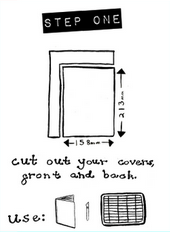
 My final piece is my sketchbook manual, an accordion book instruction manual on how to create a hand-made sketchbook by using a bookbinding method, like my own hand-made sketchbook. I began this process by planning out each page in my booklet. I made a dummy-book in which I simply marked on each page the title of each section. I then began to draw and write my content, beginning with the tools, terms and knots lists. I drew out each illustration in pencil first before then going over them with ink and a paintbrush. This technique of inking gives a very bold yet smooth look to the lines. I wrote all of the text in a style of my own. Any spelling mistakes that occurred during inking were easily resolved once I had scanned the illustrations into Photoshop, as I was then able to cut and paste the letters and words around.
In Photoshop, I cut out each illustration and word and placed them onto the manual template, ensuring I fit everything I needed to on each page without making it look too cluttered.

During the making of this piece, I wanted to use communication through illustration rather than text wherever I could. For example, I used it on the middle page in the above image, on the page of terms. Rather than write the definitions, I decided to just draw them, giving me a way of explaining something in a way that looks more interesting. I wanted the keep the manual simple and clean and this technique worked very well with this theme. I also did the same on the first set of step-by-step instructions.
I used a font called Impact Label from DaFont on my titles. I chose this font because it looks very similar to the type of font commonly used in DIY manuals as it looks like a stick-on label.
 Once I had placed everything as I wanted them and added the text, I initially planned to leave it at that. However, it looked quite plain and colourless so I decided to add some colour. Sticking with the craft-y, DIY theme I decided to add splashes of colour in the shape of paint splats behind the illustrations and the Impact Label text. This would emphasise the important text (the titles) and the illustrations. I chose a pale green colour to go behind the pictures and a dark green colour to go behind the Impact Label text. Green is a very easy colour to look at and would not distract away from the instructions too much. I chose to put dark green on the titles and light green on the pictures because it creates a visual hierarchy as the eye would naturally go from dark colours to light colours. Choosing to put the colours where they are aids the reading of the manual. I decided not to add colour behind the hand-written text as that would be too much and make it look cluttered and confusing.
I am very pleased with the outcome of my sketchbook manual as it looked even better once printed. From this task, I gained further experience of using Photoshop and learnt how to colour in hand-drawn shapes. I also gained the experience of using ink and a paintbrush to outline drawings. I liked the look that inking gave: a smooth, bold black that is very easy to work with in Photoshop. I learnt how to effectively use a mixture of hand-written and digital text on a piece while still giving a consistant overall look.

No comments:
Post a Comment