

A brainstorm of ideas for my magazine

A moodboard

Another moodboard


Another rough draft of a magazine front cover idea
 A rough draft of a magazine double-page spread idea


Another rough draft of a magazine double-page spread idea

A neat draft of my final front cover

A neat draft of my final double-page spread
 |
A page of designs for my cover lines and illustrations
|

Practice sketches of my cover photo


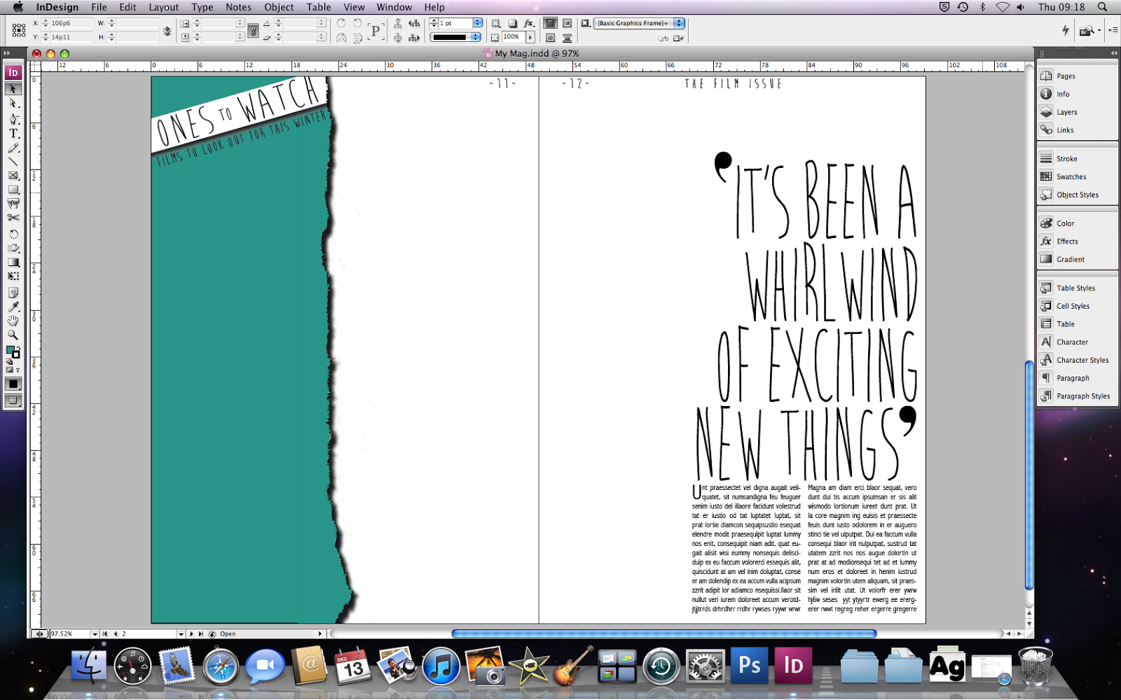 For my double-page spread, I began with placing the main text: the pullquote, article, subtitle and the page numbers and issue title. To create the ripped edge on the sidebar, I ripped an edge of a piece of paper and scanned it. I then edited the scan in photoshop to make the rip green, longer and give it a drop shadow. I placed a white banner across the top for the sub-title.
 Next, I added the movie stills to the sidebar. First, I placed a white square for the frame and tilted it. I placed the still on top of it and left a boarder. I made sure to leave enough room next to the pictures for the text.

 I used a photo from my photoshoot for my double-page picture photo. I edited it, making it black and white and giving her an outer glow, similar to the photo of Emma Watson. I also moved the iconography to create white space.
I began with the typography on my front cover. I used the font 'Brain Flower' for the coverlines because it looked handwritten and quirky. I used the font 'Colors of Autumn' for the main titles.
I then added a placeholder photo of Emma Watson on a white background for the cover.

I did a photo shoot with my friend, attempting to mimic a similar pose and expression as the photo of Emma Watson. I edited my photo and then gave it a background because it looked too plain on white. I made a pale purple background with a pattern overlay of white diamonds.
I added the text on the sidebar and made the film title bigger than the body text. I then added the placeholder picture of Emma Watson on to my double-page spread. I added my hand-drawn iconography of things to do with films related to Emma Watson: Harry Potter and The Perks of Being a Wallflower.
No comments:
Post a Comment