28 Jan 2013

Zines


A zine is "a small circulation self-published work of original texts and images". To make the book, I tore a sheet of thin A4 card into two pieces of A5. I then folded these two pieces in half and slot one inside the other to create a small book with 8 pages. For most of the drawings in my zine, I was inspired by something I like.


Page One
For my front cover, I drew an infinity symbol densely decorated with random shapes and patterns. I was inspired by a favourite quote of mine "and in that moment, I swear we were infinite" from the book The Perks of Being a Wallflower.


Page Two
On my second page, I drew a feather in a frame in an aztec style.


Page Three
On my third page, I covered the page in the words "the cake is a lie" with a small cake in the corner. This in reference to and inspired by the video game 'Portal' which is where the quote is from.


Page Four

The drawing on my fourth page is a computer with a smashed monitor with sunflowers growing out of it. The quote above and below the picture is a quote from Pixar director and idol of mine, John Lasseter.


Page Five
On my fifth page, I drew the door of the TARDIS from one of my favourite television shows, 'Doctor Who'.


Page Six
On my sixth page, I drew a bird flying free from a birdcage. This was inspired by the quote from Jane Eyre "I am no bird; and no net ensnares me."


Page Seven
On my seventh page, I drew an ocean scene. This is the only page in my zine that I am not satisfied with because I put the least thought into the content of the drawing.

Page Eight
On the last page of my zine, I drew an owl in a cute cartoon style.

27 Jan 2013

Painting

We practiced painting and mixing colours from the colour wheel. We learnt about primary, complementary and amalgous colours and how to mix them to get cooler and warmed tones.


11 Jan 2013

Photoshop Blending Modes and Layer Styles

Mountain Poster:

This is what I began with: the photo of the mountain and the title.

Firstly, I changed the colours. I changed the white background to a pale brown colour and edited the colours and tones of the mountain photo by using the blending options.

I then added a 'grunge' texture to the whole poster and laid over it. I edited the opacity settings to make the texture more transparents and subtle so that it would blend in well with the poster. I also changed the blending options of the text so that it would match the style of the rest of the poster.

Finally, I added final detail: a circle shape to go over the tip of the mountain in the photo. I changed the opacity and blending options of this shape to make it transparent and to keep it consistant with the worn/faded style of the poster.


Shapes Poster:

Firstly, I created all of the shapes and tried to make them exactly the same size and colour as on the original. The triangles and circle were easy to create, and to create the rainbow shape I drew concentric circles and then cut them in half. I then coloured all of the shapes the same colour as in the original and then changed the blending options for each shape to 'multiply' to create the transparent effect. I also ensured that all of my layers were in the right order so that the correct shapes sat on top of each other in the right order. 

I then created the rest of the shapes that were less simple to create: the clouds and the asterisks. To do this, I create shapes and stitched them together to create the final shape I required. I made the asterisks by drawing a circle and a triangle, joining them together into an ice-cream shape, copying it and joining the ice-cream shapes by the tips into one shape and then copying this into 3 sets conjoined  ice-cream shapes and rotating them to create an asterisk. For the cloud, I simply drew lots of circles together to create the bubbly shape and then cutting off the bottom into a horizontal line.

Finally, I added texture to the couple of shapes that needed it. To do this, I added noise and then edited the opacity until I was happy with it.


Weathered Photograph:


This is the original picture from the film.

I firstly added a texture over the top of the photo and edited the opacity so that it blended in with the photo.

I then used a smudged brush tool to paint lens flares onto the photo in bright purple.

Finally, I added a block of purple over the top of the photo and changed its opacity. I then painted white dots with the same smudged paintbrush around the edge of the photo.


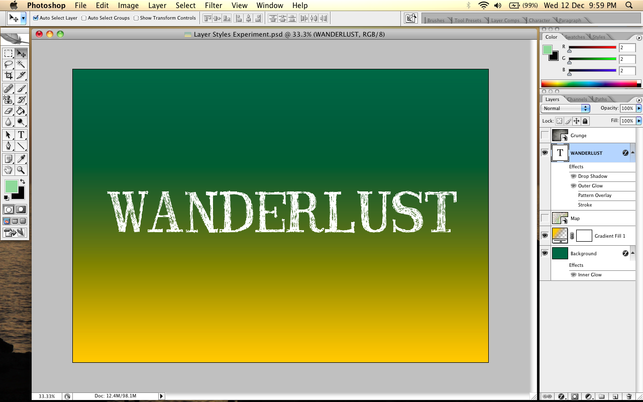
Text and Layer Styles

I began with my text on a simple green background. I chose to use the font 'Travel Book' downloaded from FontDoc to go with my travel-themed idea.

I then added a gradient of a contrasting yellow/orange colour to the background. I made the gradient horizontal with the lighter colour at the bottom.

Next, I added an overlay image of a map, continuing with my travel theme. I changed the opacity of the picture to make it transparent so that the background colours would seep through.

I then added another overlay image, this time a grunge texture. I changed the opacity of this image, too, so that both the background colours and the map would seep through, blending all of the background layers together.

Finally, I added effects to the text. I added a subtle drop shadow to the text and a soft light outer glow. I also added a slightly dark inner glow to the background to darken the edges of the canvas and add to the weathered look.


10 Jan 2013

Graphics Workshop Piece


During half term, I went to a graphics workshop with Alice Pattullo, a graphic designer, and made this little book of films. Each page is a minimalistic poster of a movie I like.


9 Jan 2013

Mock Exam - Film Posters

Brainstorms:


Drafts:


Photos and Videos:

Up (2009)


500 Days of Summer (2009)


The Perks of Being a Wallflower (2012)


Making My Poster - Up


I began by creating a black shape of a hot air balloon to go behind my iconography and changed the opacity of it to make it lighter and more subtle.


I then started work on the balloons. I drew an oval shape and copied and pasted it 6 times and changed the colour of each one to one of the 7 colours I wanted to use. I changed the setting of each shape to 'multiply' so that it would show shapes underneath it. I then copied and pasted more balloons from these 7 base balloons until I had enough to fill the grey background, while leaving a bit of a border.


I then made the little house. I made it by drawing a range of shapes to create the different panels of colours on the house in the film. I set almost all of the shapes to 'multiply' so that they would show the other shapes underneath and keep consistent with the balloons.


Finally, I added the title of the film 'Up' underneath the balloon in the font 'Bebas'.


I then tried another idea and replaced the title with an upward pointing arrow to represent the word 'Up', making it look more minimal.


Making My Poster - The Perks of Being a Wallflower


I began by making the background. I wanted to use a green brick wall on my background to go with one of the movie posters for the film. I found a picture on the Internet of a white brick wall and edited it in Photoshop. I made it a pale green colour and copied it twice to make the brick wall long enough to fit the page.


I then created the white flower. I drew a small white circle for the middle and then created the petals with a circle and a long triangle stitched together. I copied and pasted this shaped enough times to fit around the centre of the flower. To make the falling petal, I cut one of the petals off and created a zig zag shape at the tear. I moved the falling petal down and drew white specs from the petal falling with the petal.


Finally, I added the title of the film above the flower in the font 'Bebas'.